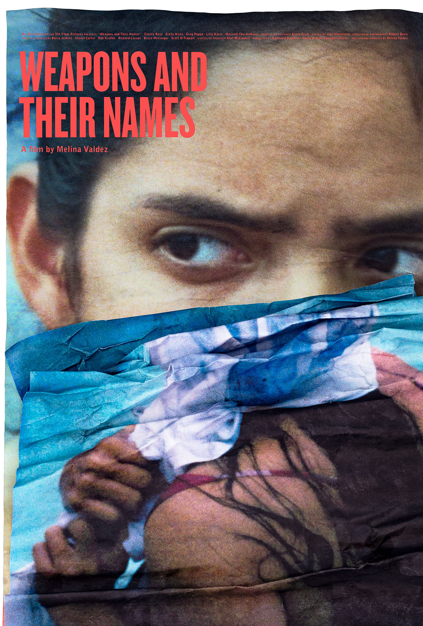
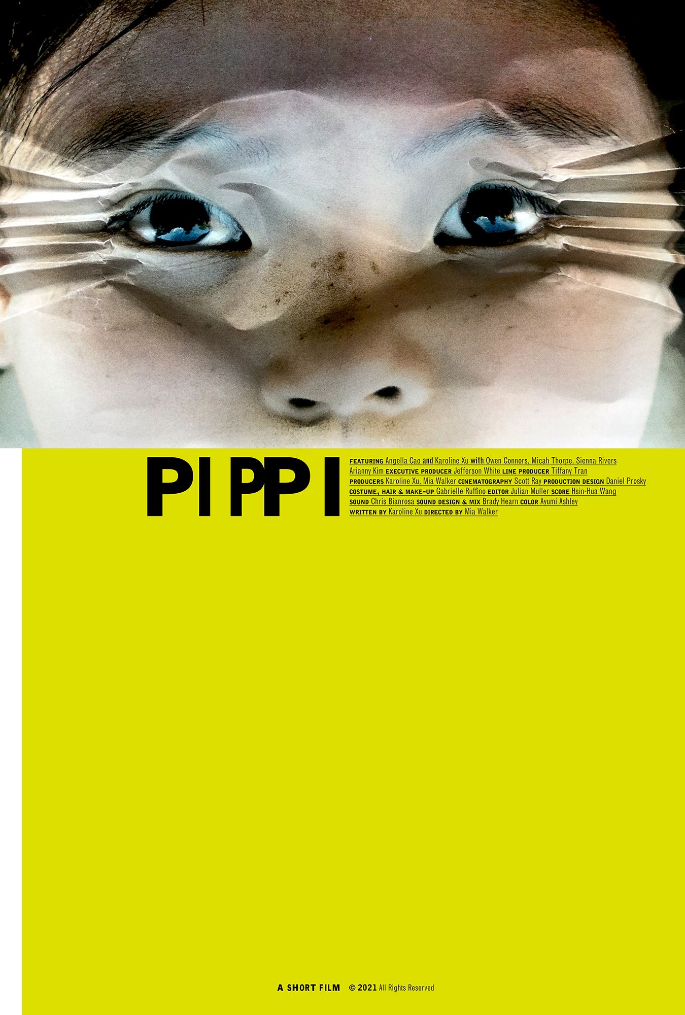
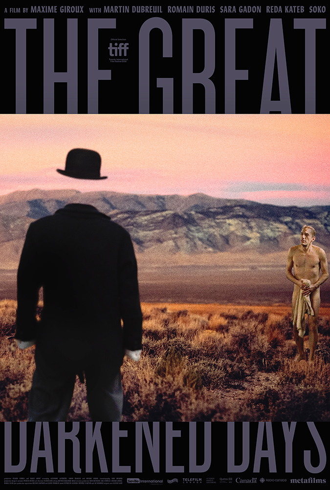
writer / director charles s. roy flew from montreal to new york to personally screen vfc for us. vfc is, as he put it, a "next generaation horror cinema experience". rather more like a virtual reality experience, vfc is not a film in any conventional sense. however it is also nothing like virtual reality.
to watch vfc you have to wear a headset. it's a headset that does two unusual things. it monitors your
biofeedback and it plays audio. however it doesn't play audio through your ears, it plays audio into the bone of your skull. the reason the headset monitors your biofeedback is because vfc's soundtrack changes based on how you are physically reacting to the film. this means that for every person in the cinema vfc is different sonically, based on how the viewer feels about it visually.
conceptually the reason for offering such a unique soundtrack to the film is because the film's story is about a virus that is transmitted by audio into the minds of scientists at a research facility. as the virus spreads the various scientists in the film start to lose their mind. narratively similar in some ways to the plot of the film
the thing, vfc offers an ineffable cinematic experience. for example imagine if you can those moments when the soundtrack to the film appears to jump from the cinema speakers into your head - the bone speakers in your headset making it feel like the sound virus is leaping physically inside you.
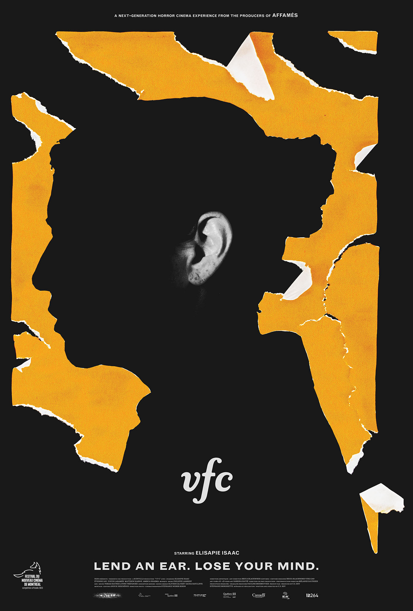
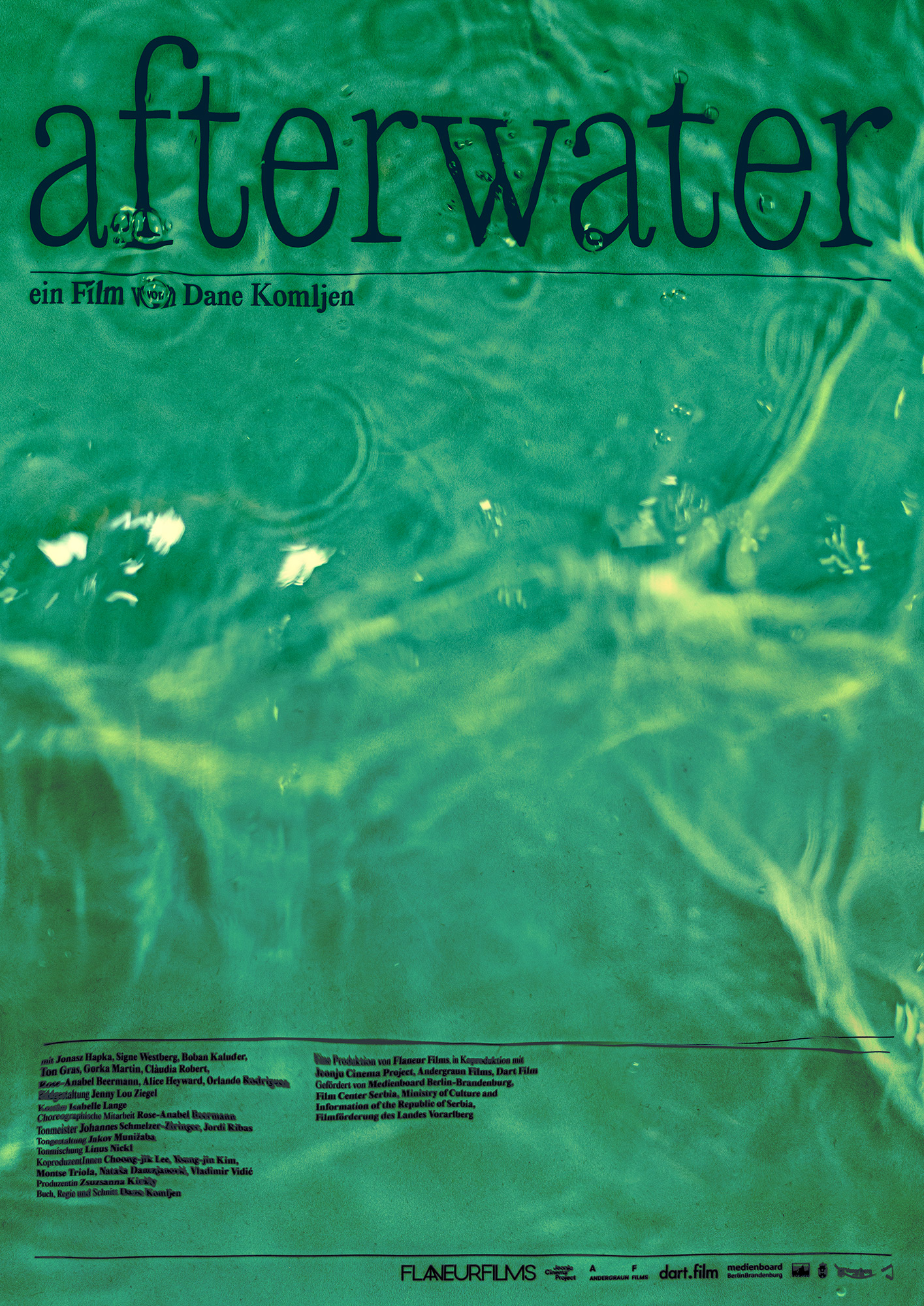
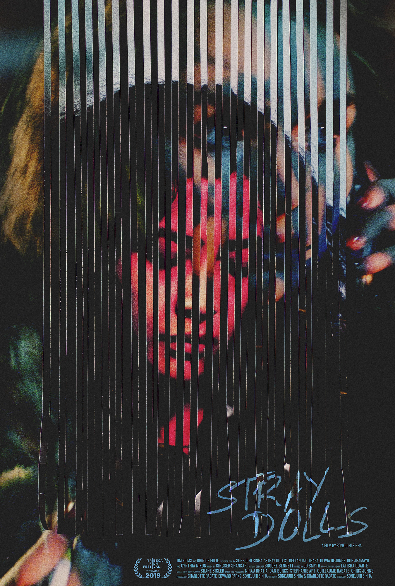
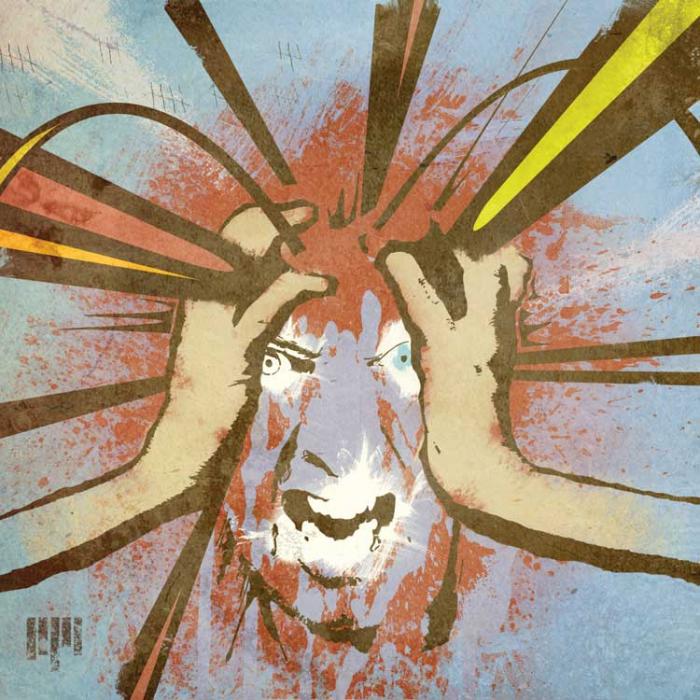
charles and caspar discussed at length ways of describing this experience with a poster. many ideas were on the table and in the end charles went with the image you see here. to capture the ear charles conducted a photoshoot in canada with the film's star
elisapie. the rest of the poster was made in berlin by caspar with a printer, a scalpel, a bowl of water, a sponge, a desk and a camera.