the film stage and MUBI have kindly included our family portrait and april posters in their best movie posters of 2024 lists. whilst MUBI placed dea kulumbegashvili’s april poster in their 2024 runners up, the film stage went as far as to consider our poster for lucy kerr’s family portrait their 7th best poster of the year.
here’s what jared mobarek at the film stage had to say about the family portrait poster:
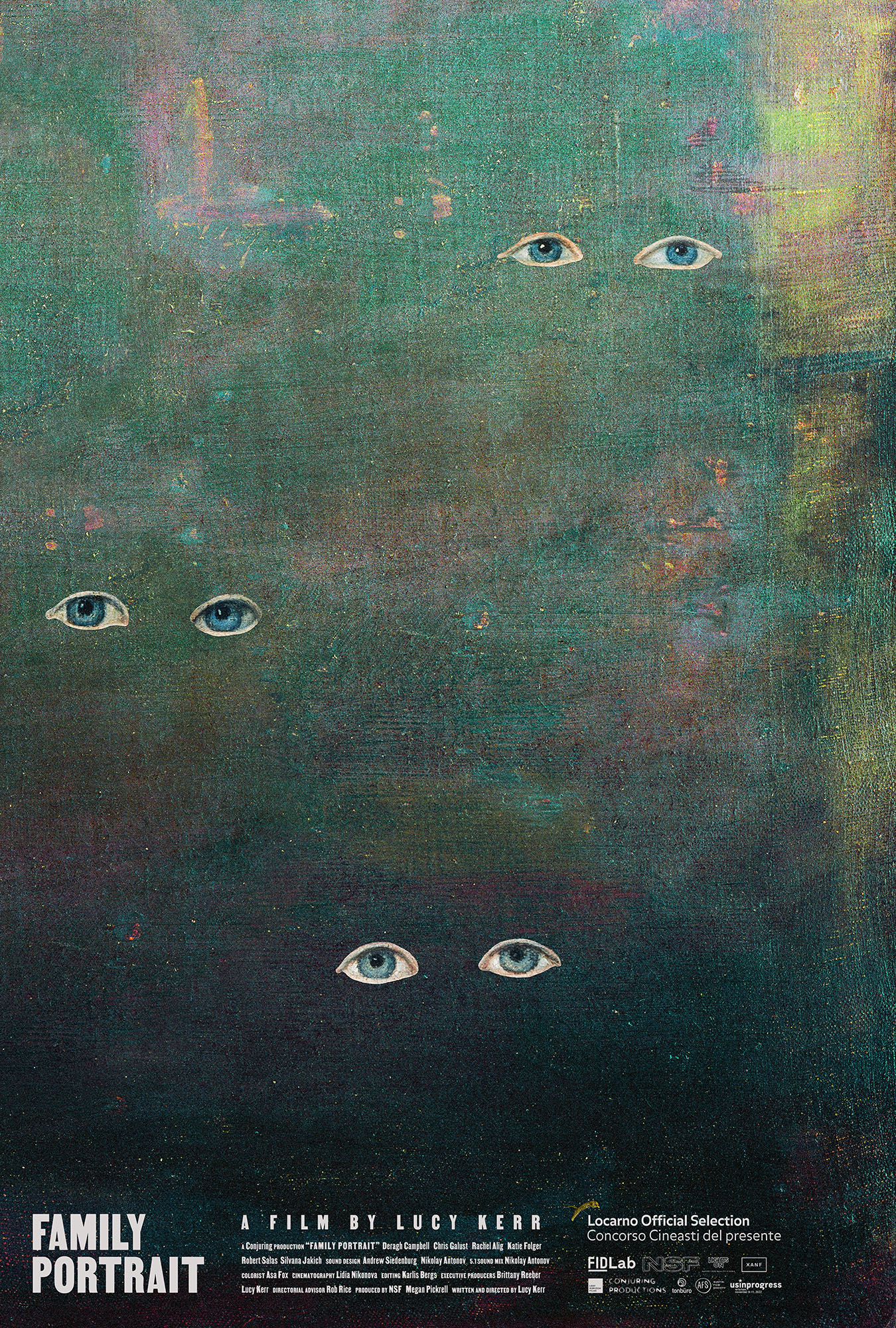
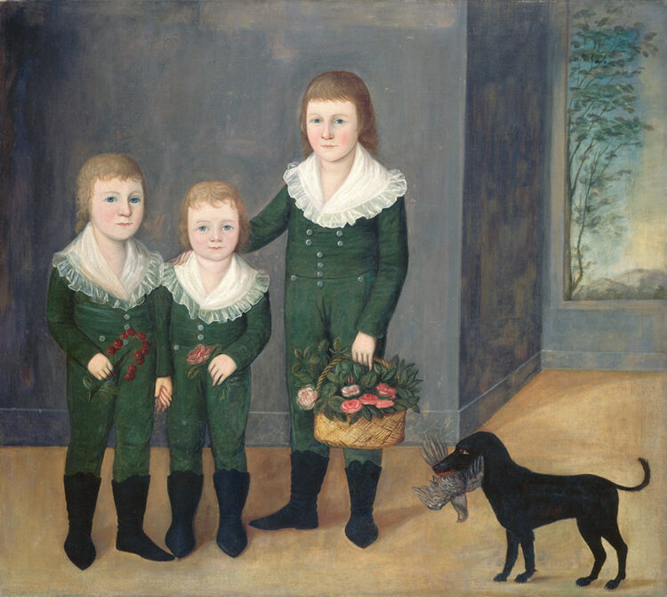
Much like the film’s commentary on absence versus presence, Caspar Newbolt’s poster for Family Portrait hinges upon the dynamic shared by those two states. Whether the hunt for a mother to take the Christmas card photo she enlisted them to take or pointed words read by the daughter searching for her so she can fly back home (“Where did my mother go when she would leave her empty gaze fixed on me?”), there arrives a shift from opposition to coexistence––we still have presence through absence and can be absent despite our presence. Thus Newbolt cuts the eyes out of Joshua Johnson’s The Westwood Children and places them upon a textured wash of color that thematically erases the bodies while simultaneously promising they’ll exit the fog next. It’s an illusion. Just like the photo. Because a finished product was never the goal; the portrait was simply an excuse to physically reunite one more time… just in case next year proves too late.
a huge thank you again to jared, adrian curry and both of their institutions for the continued support of our work.
this is the second of our posters that has been acquired by the academy. we’re incredibly grateful to gordon spates and everyone else at the margaret herrick library for their interest in and support of our work.
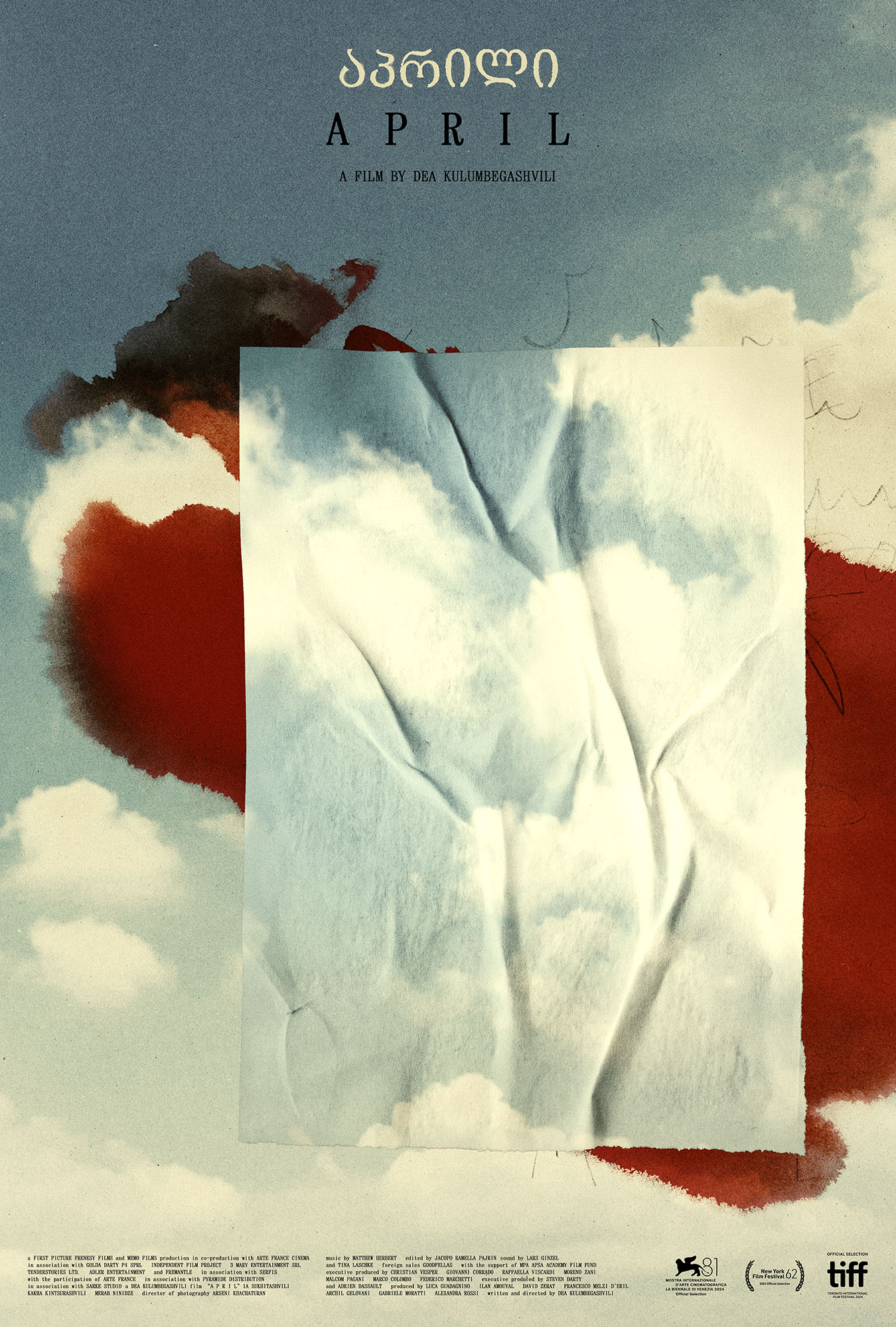
our poster for dea kulumbegashvili’s second feature film, april, was selected as MUBI’s movie poster of the day today. a massive thank you once again to adrian curry for his continued interest in and support of our work.
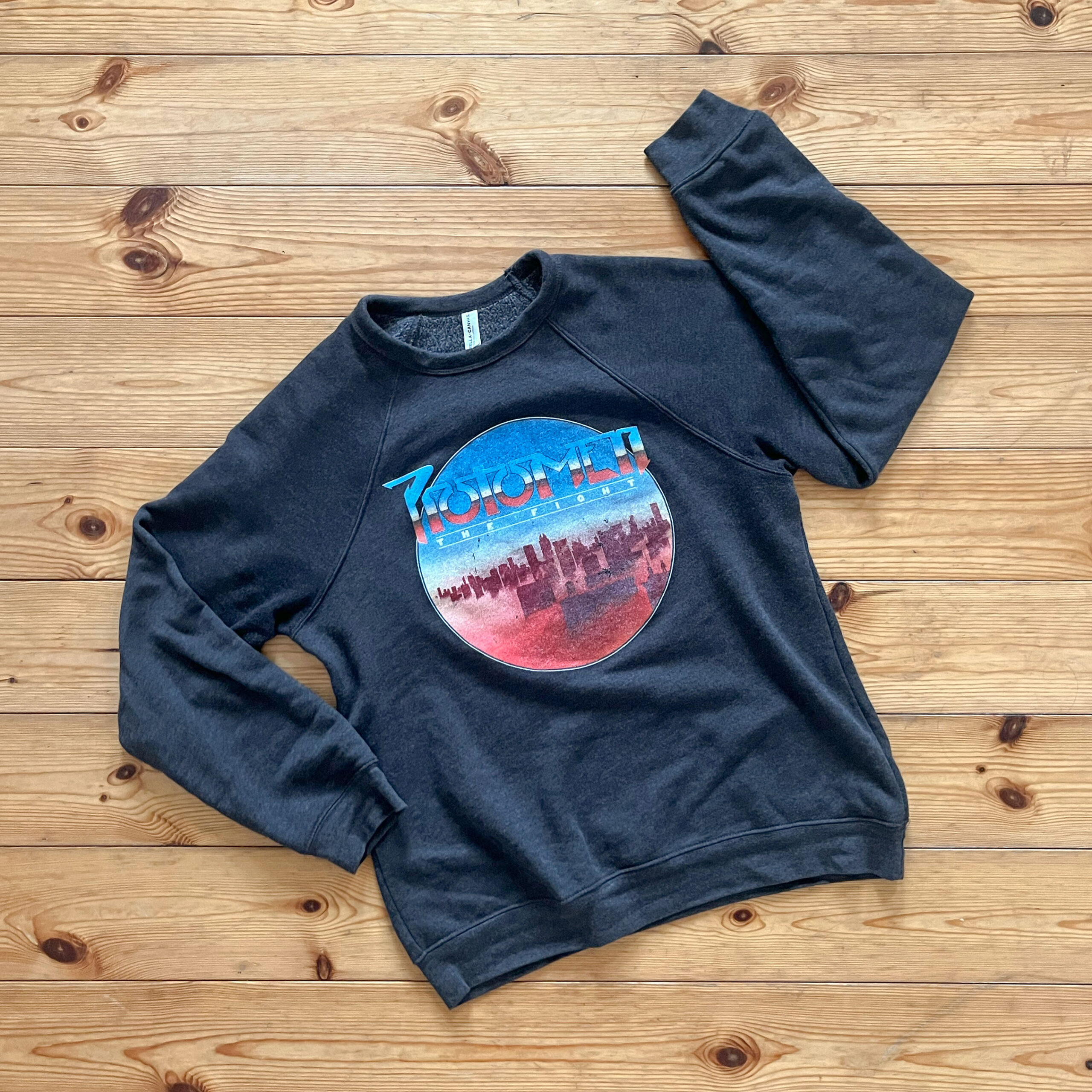
anyone who has been to a protomen show will know that the line for the band’s merch booth is often as long as the line for the show itself. over the years we’ve enjoyed experimenting with different ways to convert the band’s complex record sleeve artwork into a set of simpler graphic treatments more suited for clothing.
every so often we put our human heads together with their robot heads and make something particularly great. case in point: the original, 2009, charcoal, “act II: the father of death” t-shirt—whilst almost in absolute pieces—caspar still wears. other shirts of note include the original “keep quiet” and “breaking out” shirts.
the new “the fight” sweatshirt you see above, however, is our favourite piece of protomen merch to date. the image on the shirt being in part the work of the undeniable john delucca. we picked one up at the protomen’s 20th anniversary show in nashville back in april, and even the folks here in berlin keep asking how to get one. the clincher being that aside from the graphics on the front, it’s remarkably soft and comfortable. the band found a sweatshirt fabric for this one that kinda defies belief.
to that end we wanted to post a photograph of it here to raise further awareness of its tacit excellence. should you want to get one at any point, you can do so here.
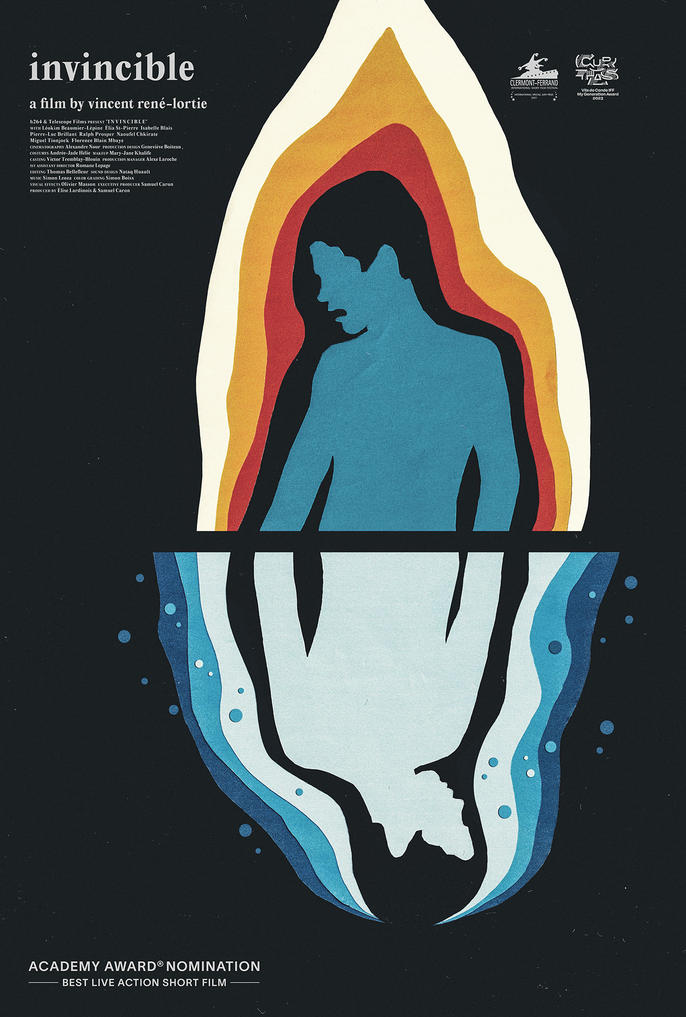
(version_industries) and Caspar Newbolt also go the painted route for Family Portrait (limited, June 28), but from a wholly different angle. Rather than create something from scratch, they have gone back in time to reappropriate an old master painting: Joshua Johnson’s The Westwood Children. That canvas becomes the source of these three sets of eyes, cutout and repositioned for the shift from landscape to portrait as their bodies become lost within the void of a highly textured field of muddied color.
It’s a memorable piece that alludes to the film’s disappearance of a character while trying to take a photo of the group. There’s mystery in that absence of form and horror in the fact that these eyes stare at us unperturbed, as though they know what happened and might in fact be the cause. And there’s a symbolic read of Shakespeare’s quote that “the eyes are a window to our soul” included as well. What more do we need to immortalize ourselves than them?
thank you to jared and the film stage for their continued appreciation and support of out work.
caspar was recently interviewed by florence scott-anderton, the film editor of the berliner magazine. the interview can be found in the latest issue of the magazine, which will be on newsstands in berlin for the next month.
here are a few excerpts from the interview:
Tell us a bit about yourself; what’s your relationship to cinema? I was born in London to two English artists, and grew up in a household where making beautiful things was the most important thing. I always wanted to make films, largely because my father took them so seriously. However, we had very little money, so while I was always writing film scripts, my only real outlet for making images of any kind was with computers handed down to me by friends or family. The moment I could get one of those computers on the internet, I did. It was then I discovered I had a knack for website design and decided to start a company.
How does Version Industries fit in the film landscape? I co-founded the graphic design company Version Industries in 2003 in London. I moved to New York City in 2005 and opened a studio there. Whilst most of the paid work came from real estate brokers and the like, I was always offering our services to filmmakers and musicians whenever I could. Ten years or so later, we were making film posters and film title sequences for filmmakers such as Chloe Zhao, Tim Sutton, Jane Schoenbrun, Trey Edward Shults, Jonas Carpignano, Adam Pendleton, Cathy Yan and so on. In 2017 we also won a pitch to re-design Filmmaker Magazine. I then continued to co-design every issue from cover to cover until 2021. During this time, certain filmmakers realized it was to their advantage to have me on set as a photographer, and it was there that I learned how to make films properly myself. In 2016, after co-directing several music videos and short films with a friend, I finally wrote and directed my own short film. The 25-minute, black-and-white short, Leaving Hope, was shot by Shabier Kirchner (Small Axe, Past Lives) and produced by Rathaus Films. It came out in 2019. That same year I moved back to Europe.
What made you choose to relocate to Berlin? I had been staying with friends here since 2016, and in doing so it became clear that Berlin is still affordable enough that a significant proportion of the artistic community can and do still live here. I realized that if I was going to stay in New York I’d have to work on more commercial projects or find a different job in order to be able to afford my rent, and that was out of the question.
What do you find unique about Berlin when it comes to cinema? Thanks to festivals like the Berlinale and Unknown Pleasures and the city’s central position in Europe, Berlin remains an important hub for art filmmakers. Combine this with the German government’s interest in funding film projects — a concept that doesn’t exist where I come from — it makes for a fertile cinematic landscape.
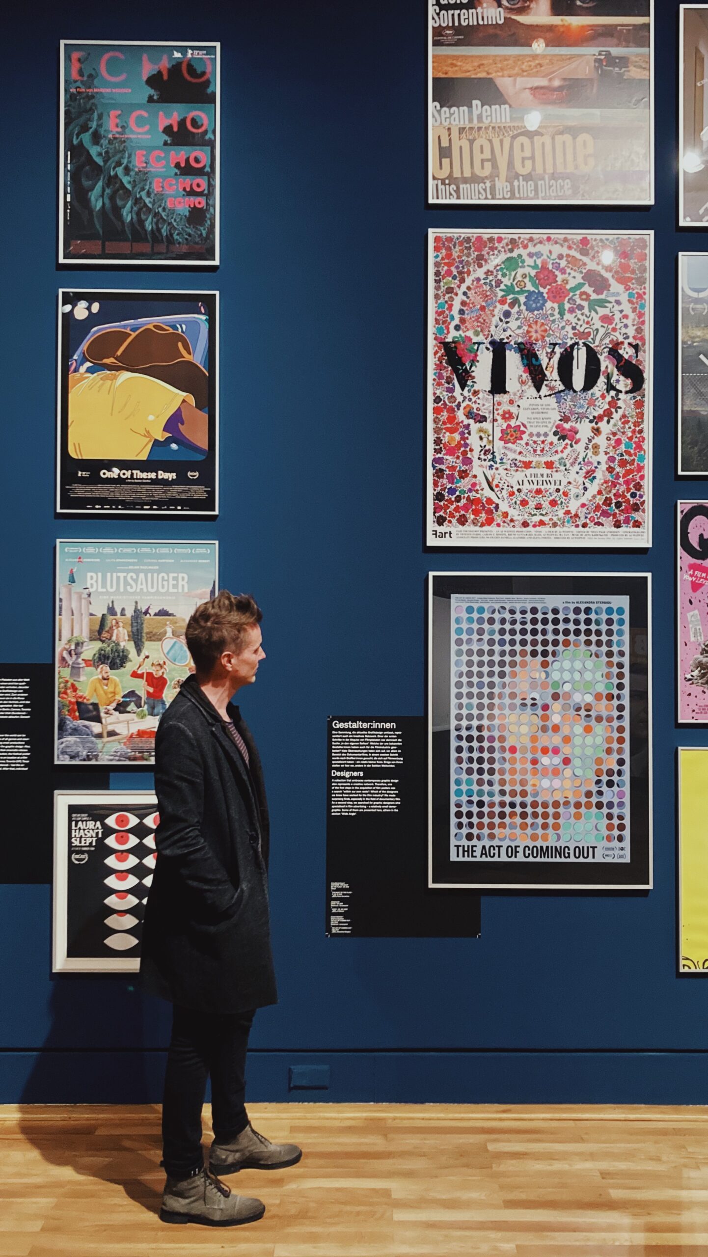
Congratulations on being recently included in the big film poster retrospective exhibition here in Berlin. Looking at the archive, would you say that Berlin has a specific influence on the art of film poster design? Thank you. My involvement notwithstanding, there really hasn’t been an exhibition of film posters of that stature before, and to that extent Berlin will, I’m sure, be seen as having a great influence on the making of film posters. I don’t think the city itself has had a particularly great influence on how film posters look aesthetically, but Germany as a country certainly has. Beyond the striking graphic qualities of German art movements such as Die Brücke and Der Blaue Reiter or the work coming out of the Bauhaus, the film poster-maker Hans Hillmann is arguably the greatest there has been to date. I look at his work regularly, and I say that as someone who rarely looks at film posters during their working process.
a huge thank you to florence for pitching the interview and for the questions. thank you also to the magazine itself for including caspar and our work in it. we’re very happy to have been included within the pages of such a berlin journalistic institution.
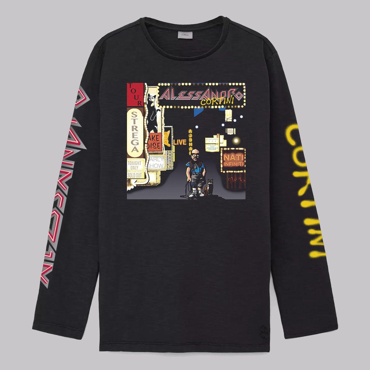
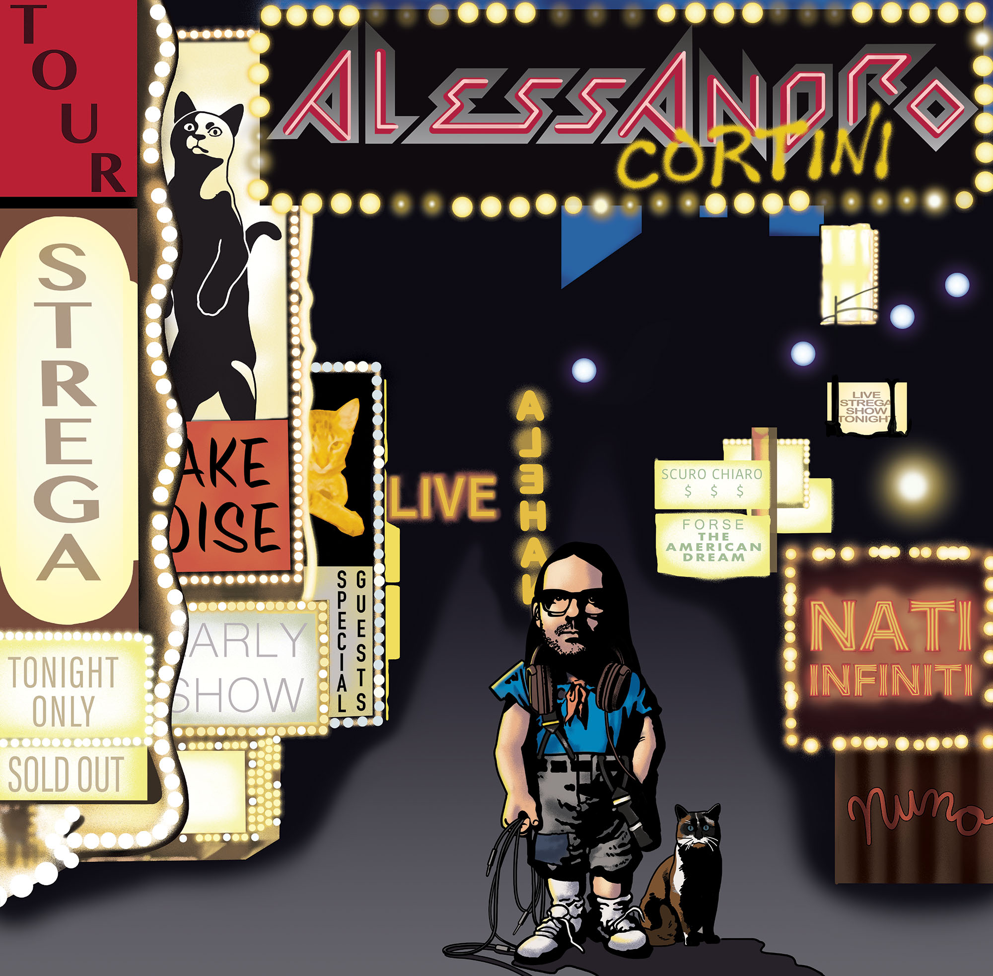
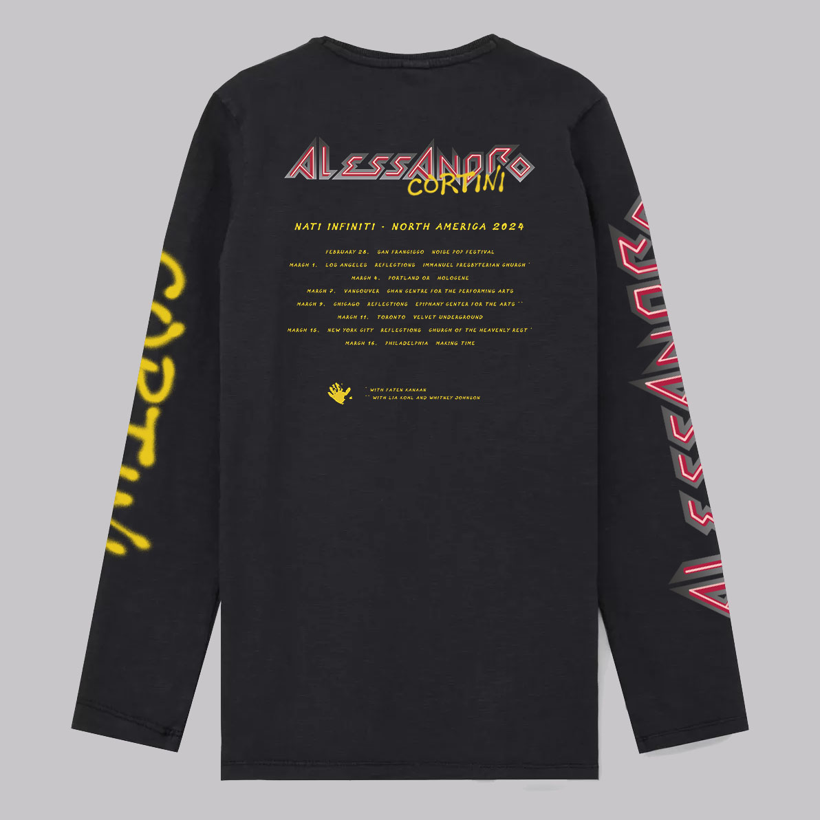
old friend alessandro cortini asked us to make a custom t-shirt for his 2024 “nati infiniti” tour of north america. years ago alessandro and caspar realized they had a shared love of certain bands, one of which was the late 80s american rock band, extreme. to this end alessandro knew who to approach with an idea he had for a new tour t-shirt.
what you see here is a custom version of the artwork for extreme’s most famous album, extreme II: pornograffitti. the brilliant john delucca painted the the entire piece, including the custom typography, from scratch. in doing so, under alessandro’s guidance, john swapped in alessandro’s likeness and various other parts of alessandro’s life and work to replace the original early 90s artwork.
caspar took care of the typographic elements on the back of the shirt and prepared the files for printing. the shirt was printed in a limited edition of 144. you can read comments on the shirt’s concept and design from alessandro’s friends and fans here.
we hope those of you that managed to snag a shirt are enjoying its many facets.
needless to say these are the first posters we’ve made for a film with an oscar nomination. a huge congratulations to vincent, samuel, élise and everyone at h264 distribution.
you can read more about the making of the posters here. the film has since been made a vimeo staff pick, and you can watch it here:
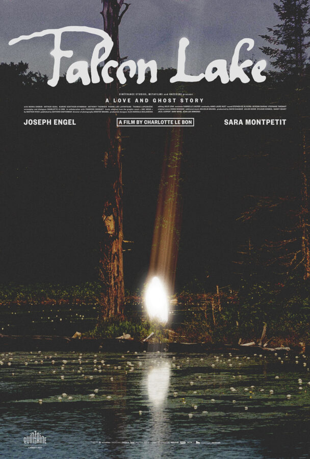
posteritatiand the film stage have kindly included our joyland and falcon lake posters in their best movie posters of 2023 lists. the film stage went as far as to consider our poster for saim sadiq’s joyland their number 1 poster of the year.
here’s what jared mobarek at the film stage had to say about the joyland poster:
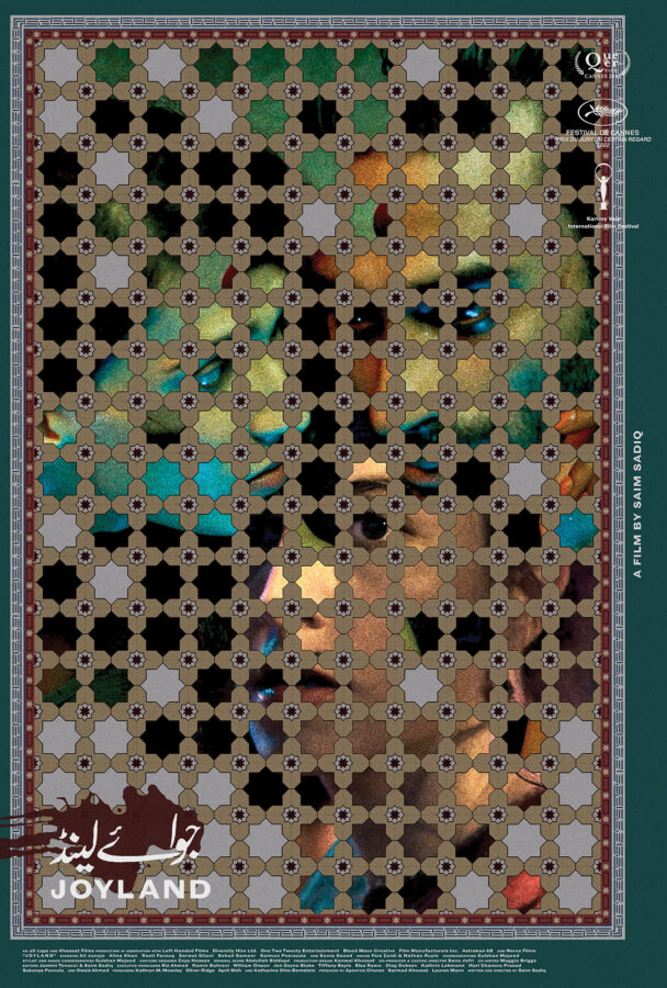
There’s so much to talk about with (version_industries) and Caspar Newbolt’s Joyland. The ornately hand-drawn floor tiles (their website always generously explains their process) doubling as a window upon the main characters. The whole’s off-center nature pushing everything into the top-left corner to provide room for text on the outside without sterilizing the composition via more symmetry. The way the three actors feel as though they exist in one scene despite a handful of lotus flowers overlapping their images to prove each has been meticulously layered atop the others. The grain, subdued colors, and blood-smeared title. It’s truly a work of art all its own and a testament to the field’s ability to sell itself as much as the product being sold.
a huge thank you to both institutions for their continued support of our work.